Boston Magazine
The iconic city magazine's brand identity gets an overhaul.Client: Metrocorp
Services: Brand identity, print and digital redesign, ongoing creative direction, copywriting
Team: Michele Snow, Toan Trinh, Colin Jaworski, Tommy White, Brittany McGuire, Katie Narduzzo, Loren Savini, Abby Bielagus
Awards: Society of Publication Designers, City and Regional Magazine Association
All city magazines promise the same thing: to capture what it means to live, work, and play – right here, right now. D. Herbert Lipson, Boston magazine’s demanding owner, legendary publisher, and (in the eyes of many) father of the modern city magazine, put it to me more directly: “We help increase the pleasure and decrease the pain of city living.”
Lipson’s model, which was innovated at Philadelphia magazine in the 1960s and perfected at Boston in the 1970s, was widely copied and quickly codified. After a few decades, most city magazines started to look alike.
This is where Boston magazine found itself in 2014. Though it continued to lead the pack with groundbreaking reporting and award-winning service journalism, it looked like any other city magazine. I was recruited to lead the creative team that reimagined the magazine’s visual presentation in a way that uniquely served its journalism, and then extended the look to digital platforms and live events.
Iconic imagery: the rigidity of the cover format allowed for flexibility in the content – and resulted in a simplicity that stood out among the clutter of the newsstand.
Variations on a theme: the annual Best of Boston issue featured stacks – of doughnuts, typography, ice cream scoops, and illuminated offices inside the Prudential tower.
I created the first cover to feature a woman of color, celebrated the artistry of our culinary scene, and got Mindy Kaling to drink a beer.
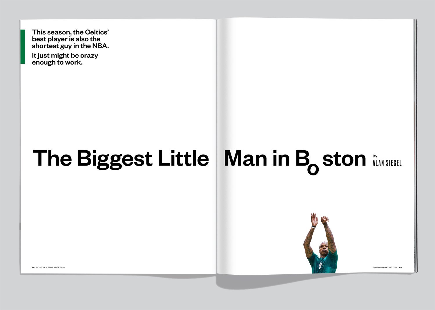
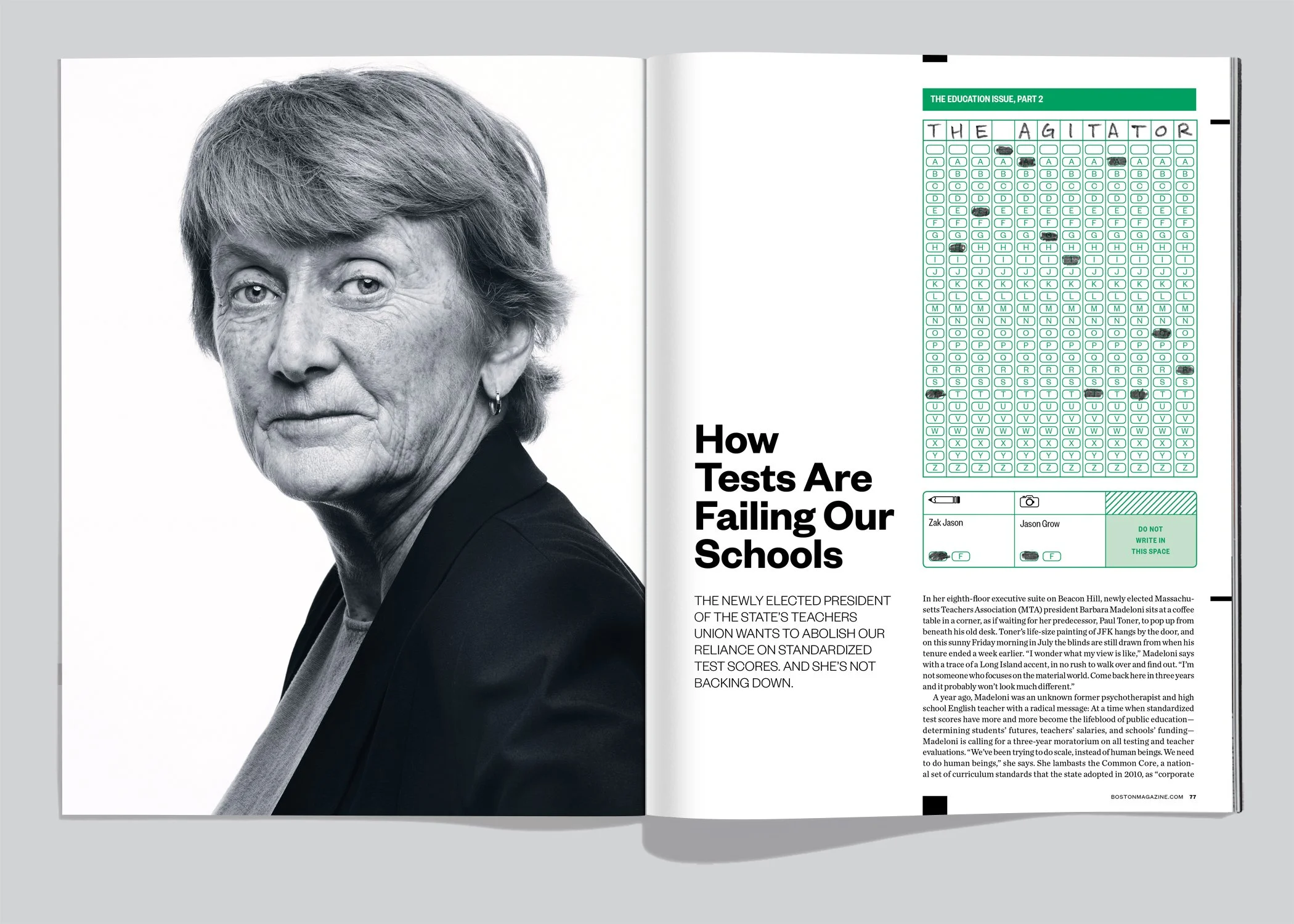
Expressive, often playful typography became a hallmark of print spreads.
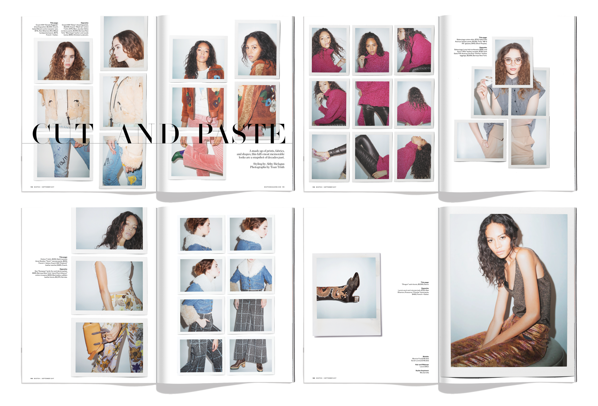
The magazine became known for its theatrical – and award winning – fashion presentations.
Carefully formatted page templates simplified section planning and page production.
Each issue included at least one bespoke package – an information-rich, multi-page report on a single topic.
The design system was expanded into the graphic identity for Best Fest – a party in Boston’s City Hall Plaza honoring the Best of Boston winners.
The team also redesigned bostonmagazine.com and its sister site, phillymag.com, infusing both with the sophistication and functionality of the refreshed identity.


