MIT Technology Review
New life for the world’s oldest technology magazine.Client: MIT
Services: Brand identity, print redesign, ongoing creative direction, design, project management, production, image retouching, copywriting
Awards: American Society of Magazine Editors, Society of Publication Designers, Society of News Designers, Council for Advancement & Support of Education, University & College Designers Association
MIT has long been celebrated for its leadership in engineering and technological innovation, but few outside of design circles know it was also a pioneer in American graphic design. Led in the 1960s by legendary designers Muriel Cooper and Jacqueline Casey, the MIT Office of Design Services developed an aesthetic that synthesized International Style typography, Bauhaus vanguardism, and American hard-edge abstraction. The distinctive form language they developed defined the look of MIT publications for decades and inspired a generation of designers.
Having helped the world’s oldest technology magazine achieve acclaim during the tech boom of the early 2000s, I was recruited by publisher and editor-in-chief Jason Pontin to reinvigorate its look in 2011. Then in 2018 I returned to the project for a third time, ultimately assuming sole responsibility for ongoing creative direction, design, and production of the bimonthly publication.
The magazine’s contemporary format — created in collaboration with Michael Bierut and Aron Fay of the renowned global design firm Pentagram — extends MIT’s tradition of graphic invention and grounds it in an elegant system that has since been adapted for online, social media, and environmental graphics.
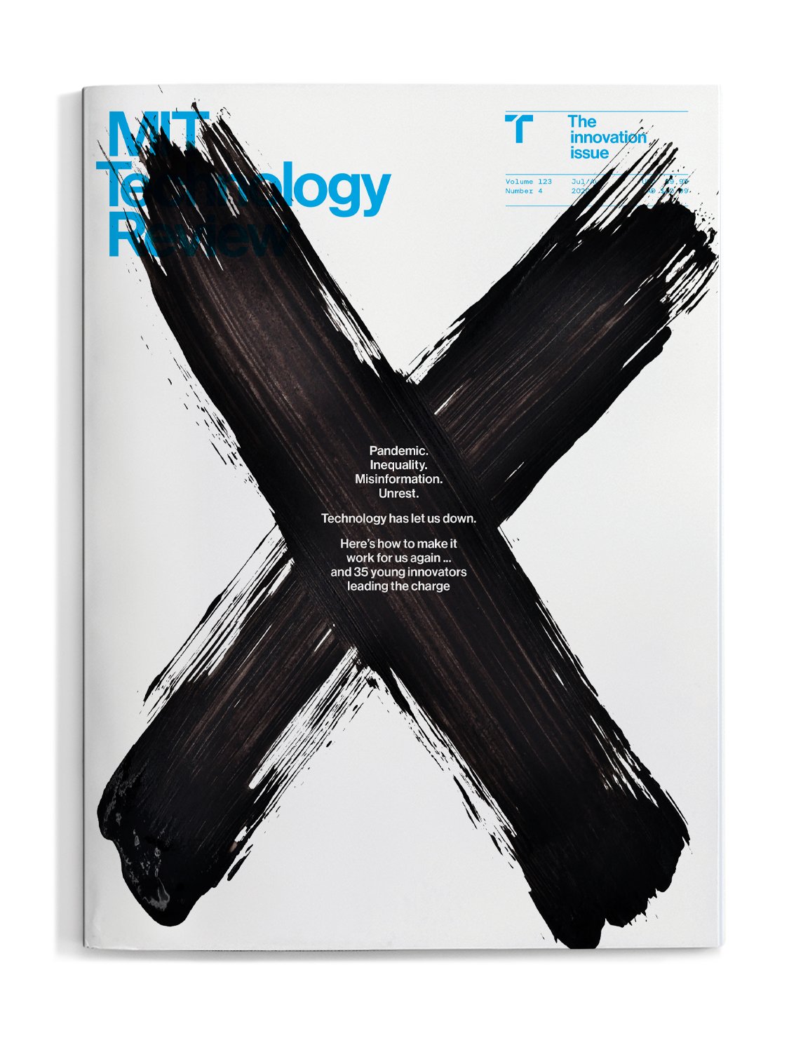
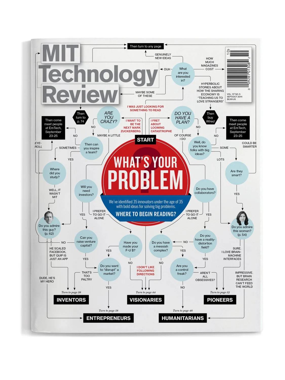
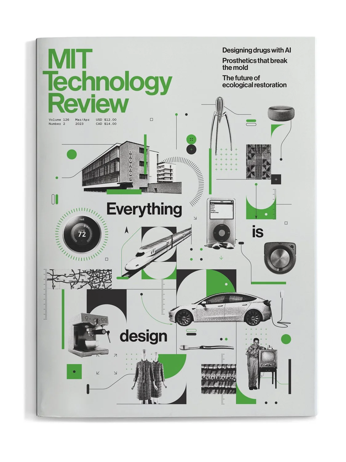
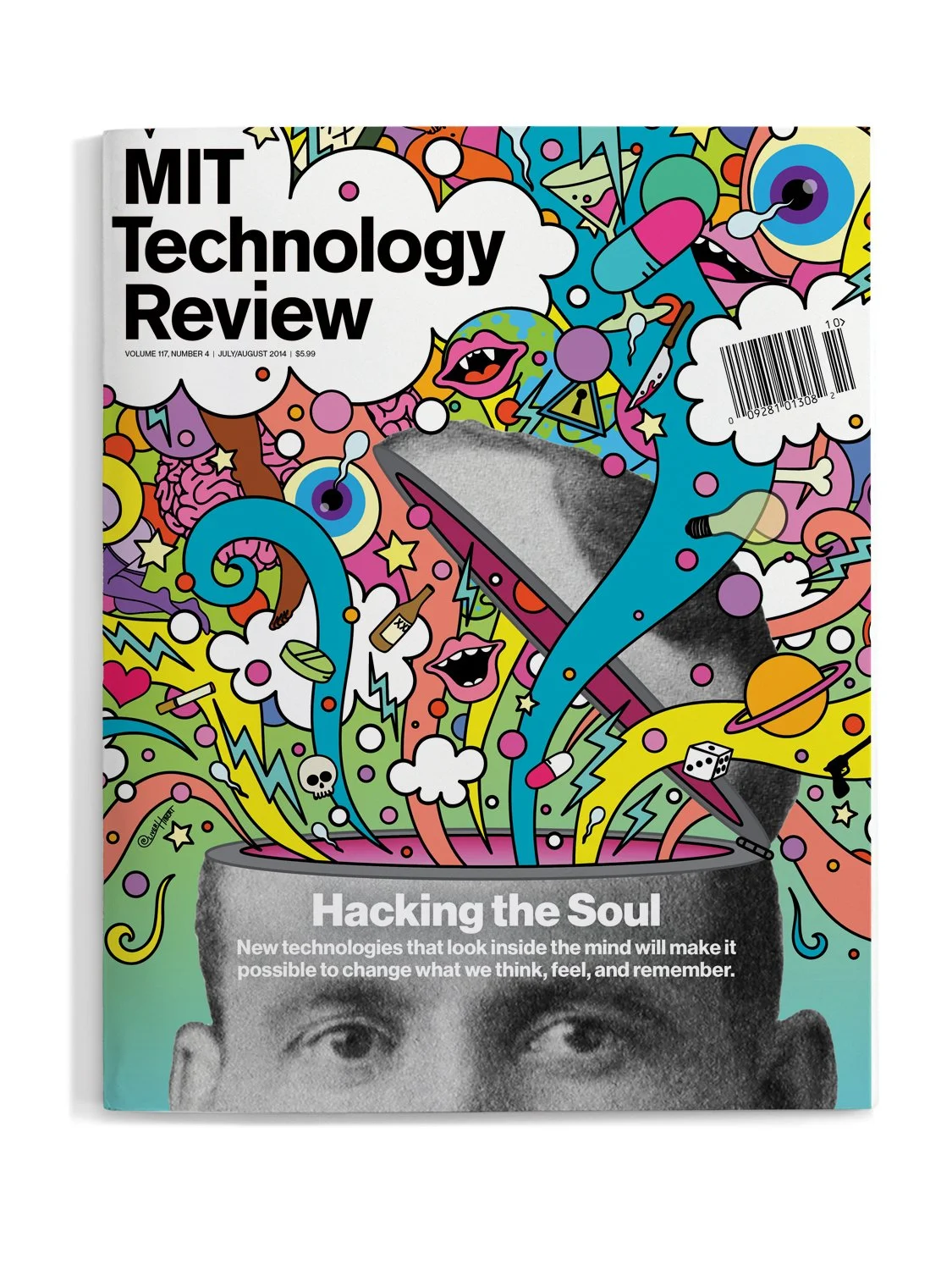
Each issue examines a single technology or theme from a range of perspectives and considers its impact on business, culture, and the environment.
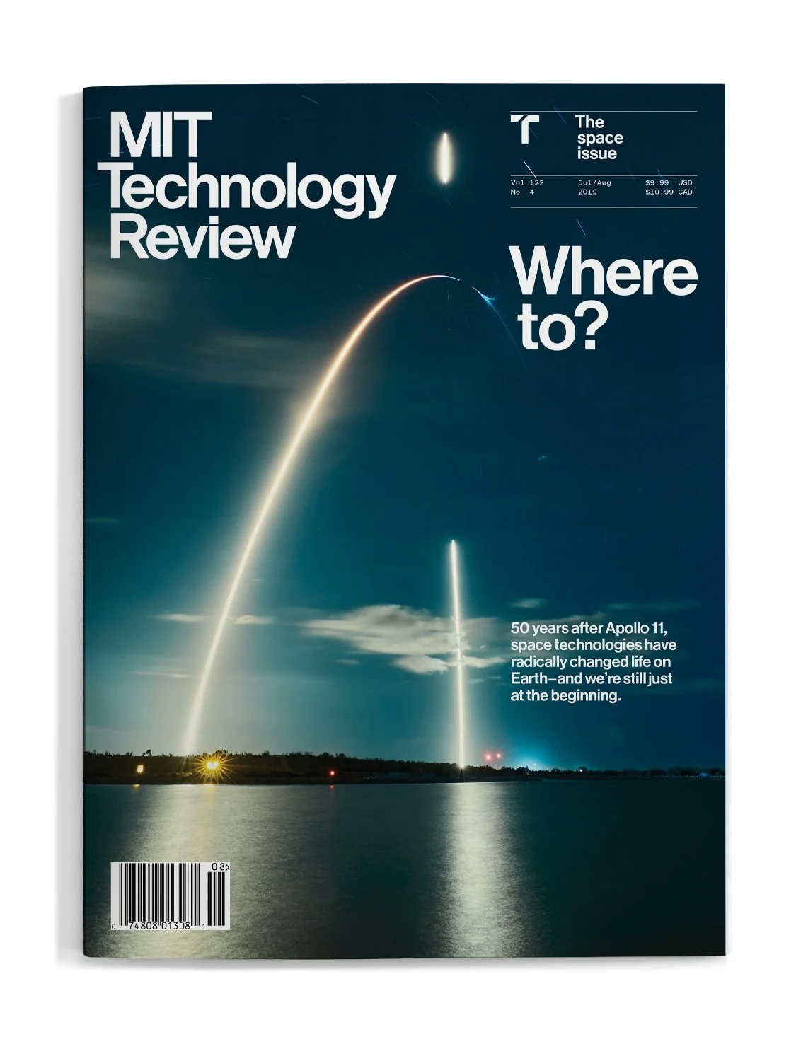
The custom logo is based on Helvetica, a nod to the Modernist experimentation of Cooper, Casey, and their collaborators.
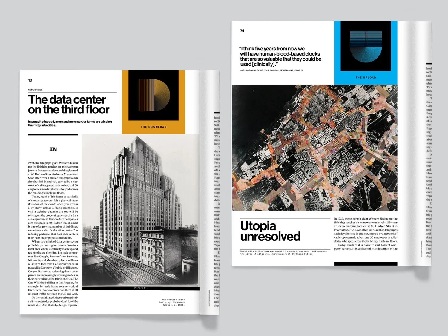
The vibrant color palette brings data and other information to life.
A carefully curated typographic palette keeps the magazine legible and consistent issue-to-issue.
The restrained use of decoration provides understated structure and eases navigation.
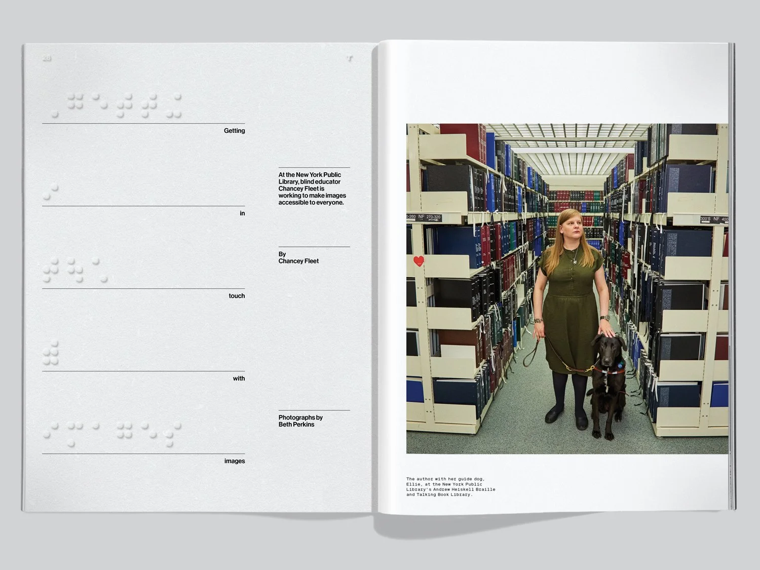
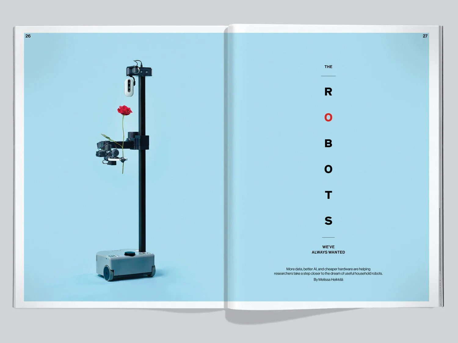
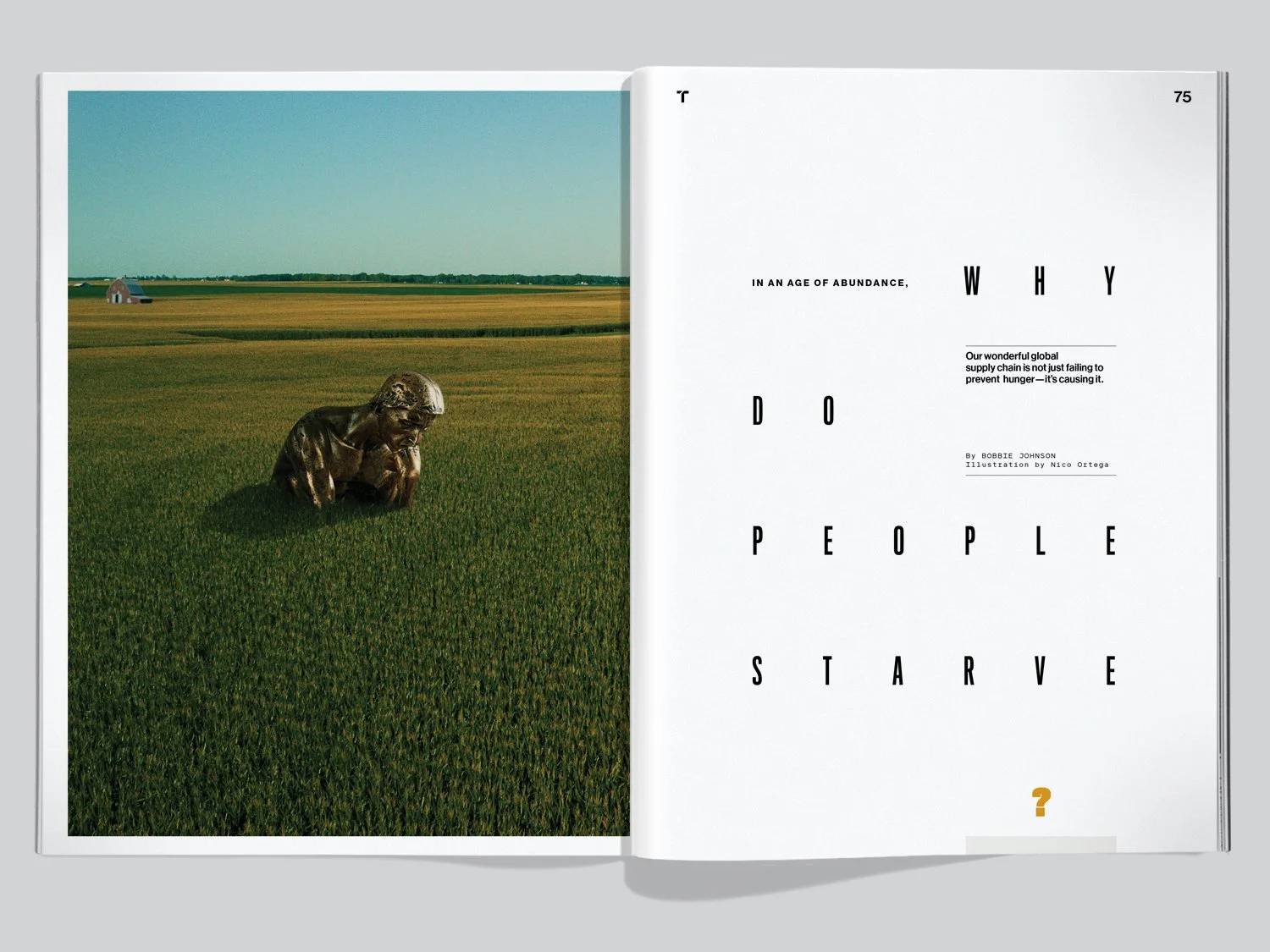
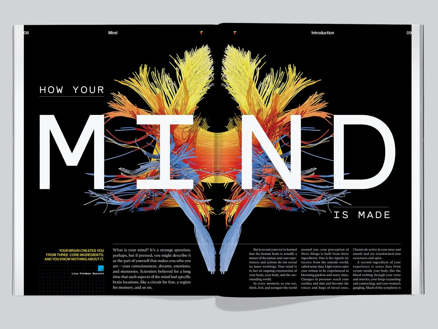
Vivid typography pairs with dramatic imagery to illustrate narrative and convey emotion in stories.
Flexibility in section and department designs allows for a range of information and voices.
Following the relaunch, newsstand sell-through rates shot to and remain at a 10-year high. The magazine has been honored with dozens of awards for design and art direction. And print magazine content cross-published online is regularly a leading driver of traffic to the companion Web site.
The design’s most lasting impact may be on MIT itself: the magazine became a touchstone in a campus-wide effort to align the aesthetic of MIT’s cultural enterprises, including the MIT Museum, MIT Libraries, and the MIT Alumni Association.


